Go back to the Home

Greenmatch: solving conversion drop-off in an acquisition flow through UX and trust optimization

This case focused on improving a lead generation flow where usability issues, accessibility barriers, and low trust signals were causing users to abandon the quote process, directly impacting lead conversion.

I transformed a high-friction acquisition flow into a clearer, trust-led experience designed to reduce abandonment and unlock higher lead conversion.

TEAM - Product designer (me), Lead Designer

MY ROLE - I conducted usability and accessibility tests, as well as UX research for improving the current design of the lead gen form

PROJECT SCOPE - Improving the lead gen form (case study assignment)

YEAR - 2024

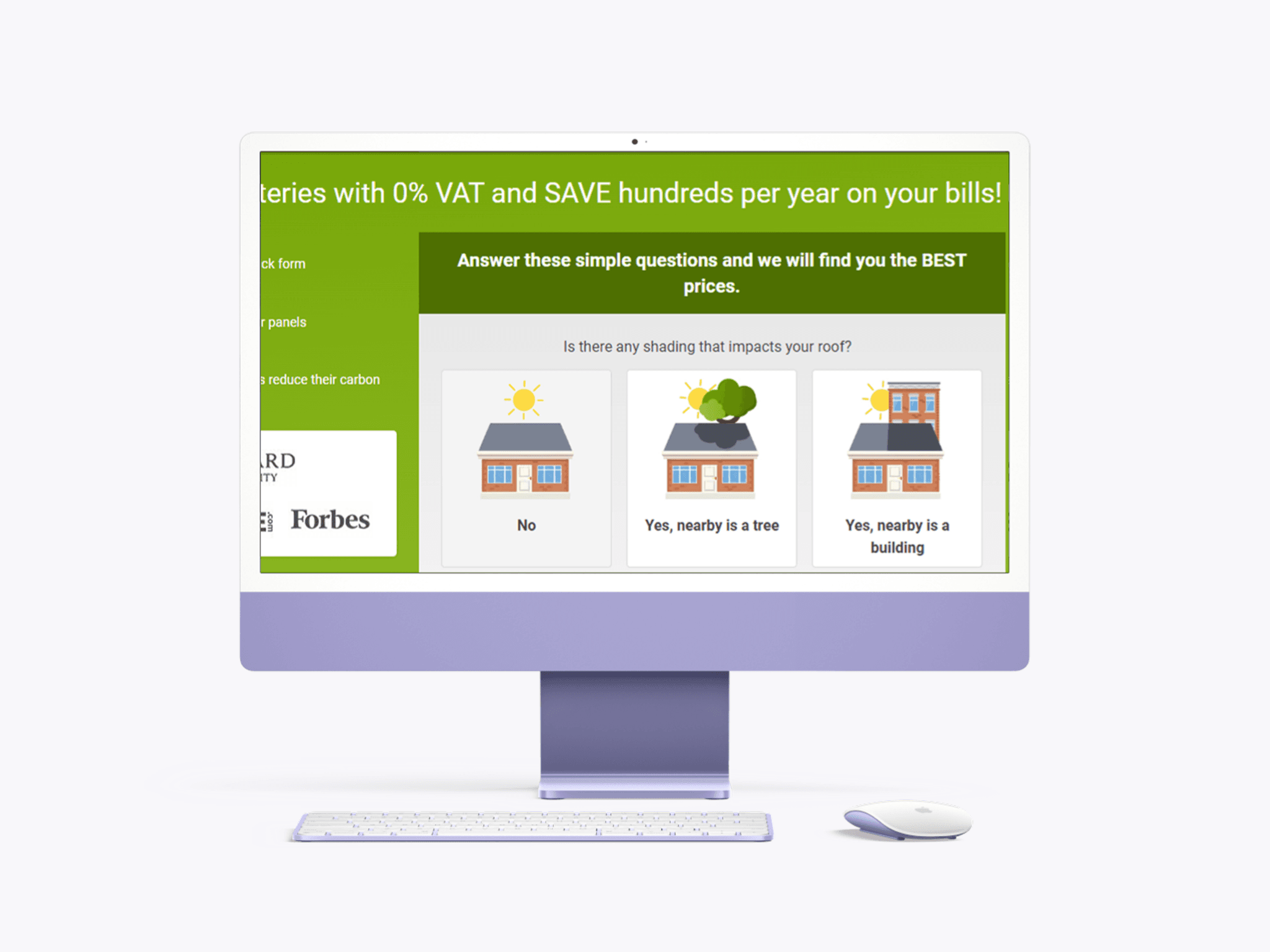
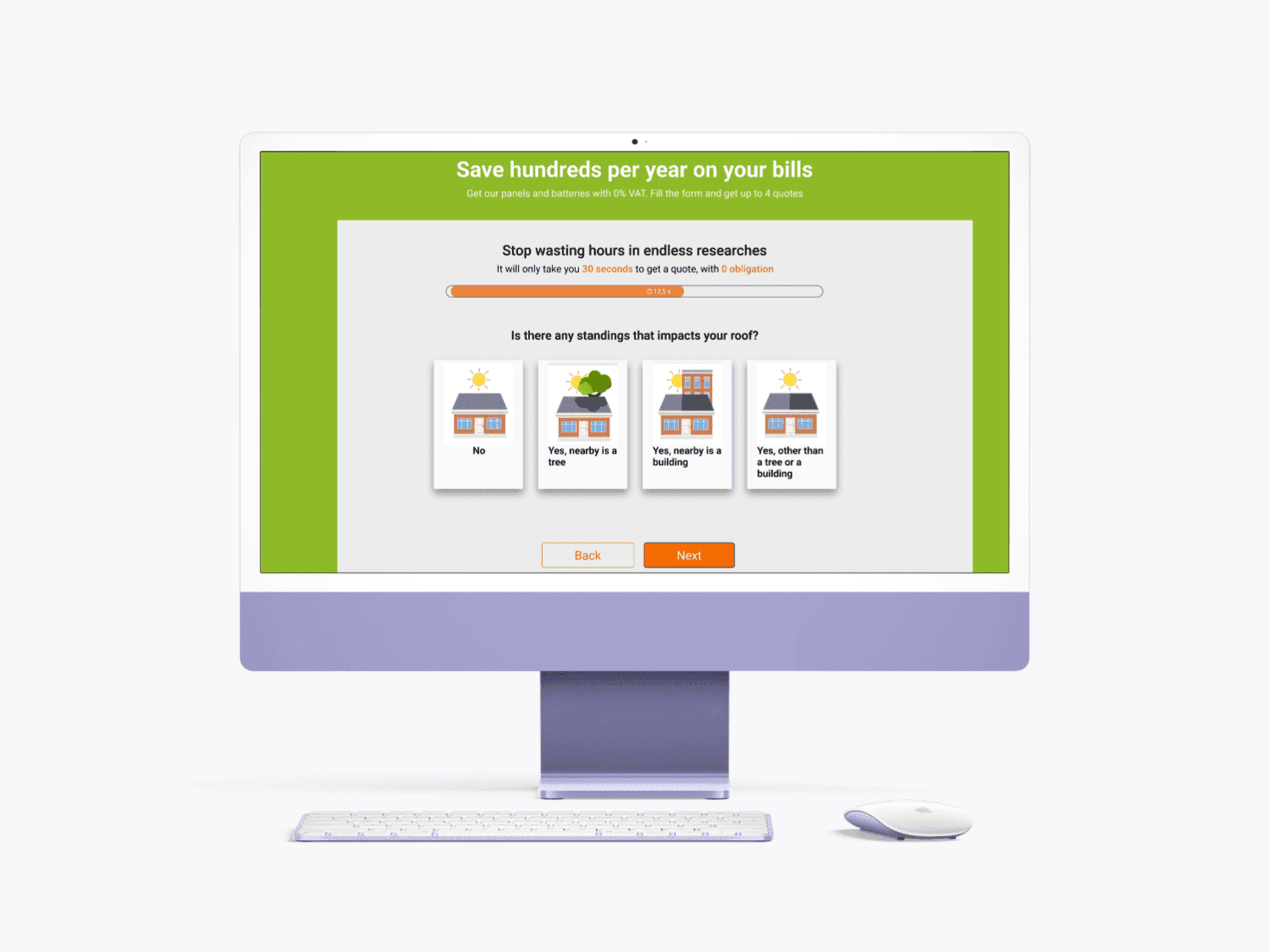
After
Before
BeforeAfter

GREENMATCH SOLAR LEAD GEN FORM - THE RESEARCH BEHIND THE REDESIGN

1/2 Three layers of discovery to uncover core issues in the form

I structured discovery into three layers:

  1. usability and accessibility evaluation of the existing flow (testing the flow, conducting accessibility tests);
  2. qualitative review analysis through Trustpilot reviews to understand abandonment triggers;
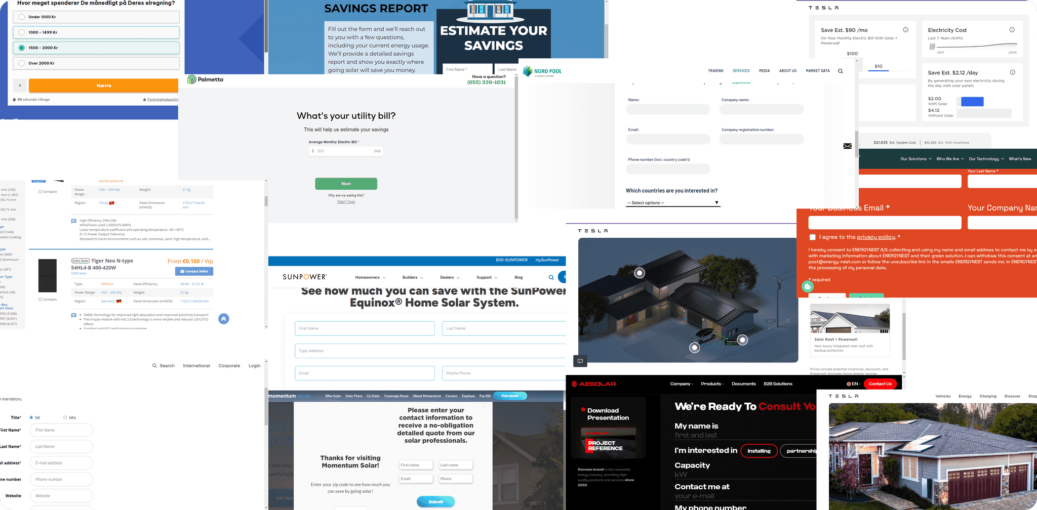
  3. competitor analysis to identify expected trust and reassurance patterns.

2/2 Putting together the findings from the research to design solutions

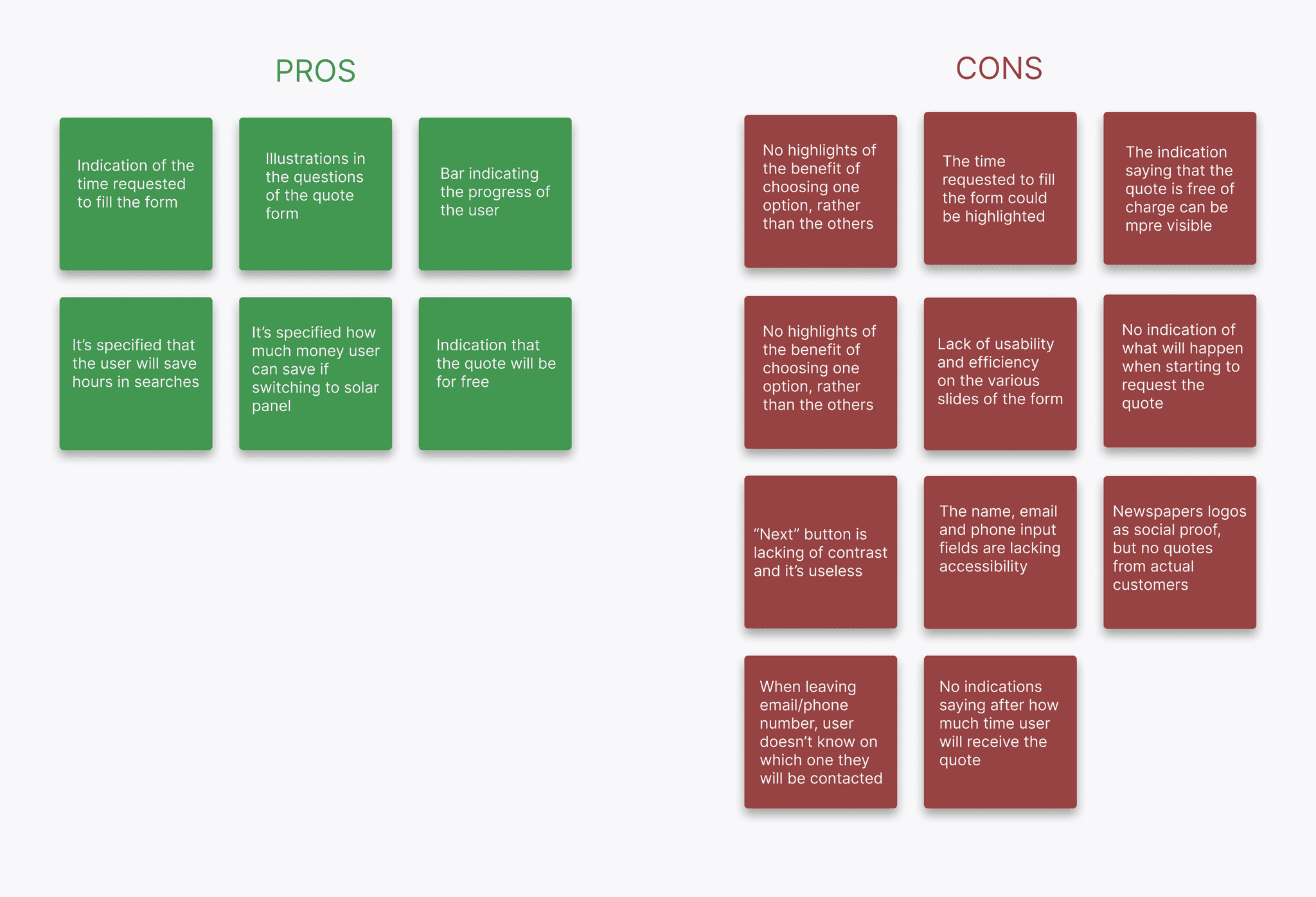
The research revelead that the core issues where not only related to lack of usability, but also lack of information and trust concerning follow-up after the form competion.

I prioritized two design solutions:

  1. reduce cognitive friction of the form by improving its structure and accessibility;
  2. increase trust and improve information about benefits and expectations after completing the flow

Conducting a competitor analysis helped me to spot some recurring patterns to be used in Greenmatch Solar form and also some elements that the competition was missing and that could help Greenmatch to stand out.

The design brief was extremely helpful for breaking down pros and cons of the current design of the form, and ideate possible solutions to fix it.

THE DESIGN SOLUTIONS TO FIX THE FORM

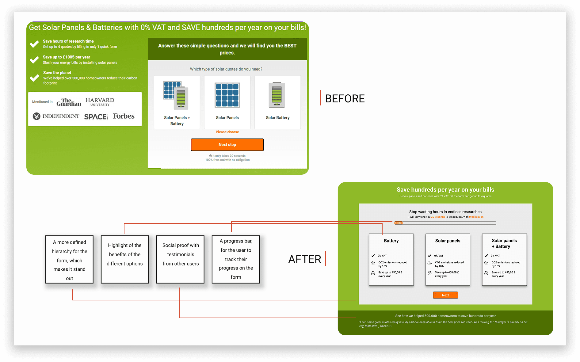
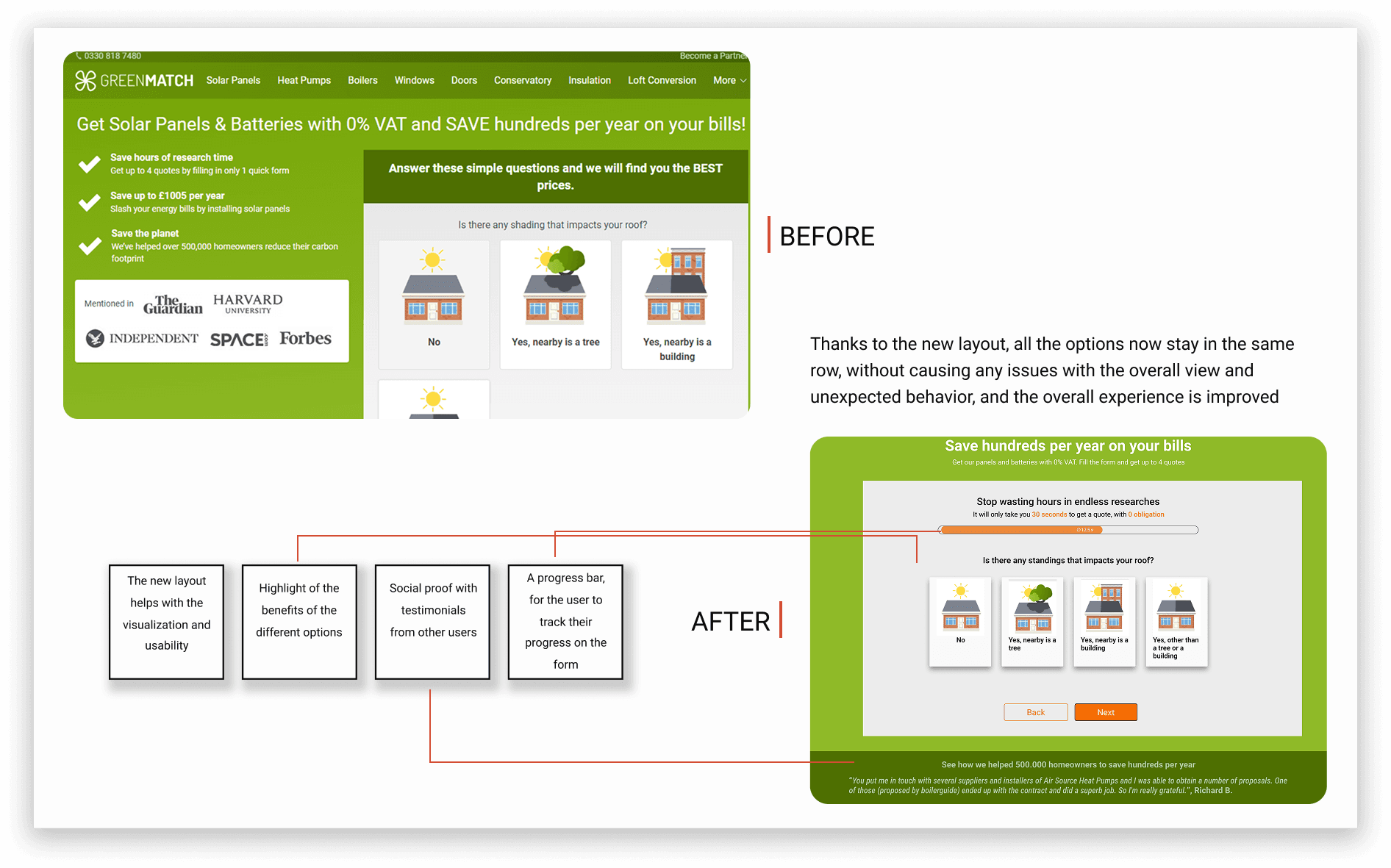
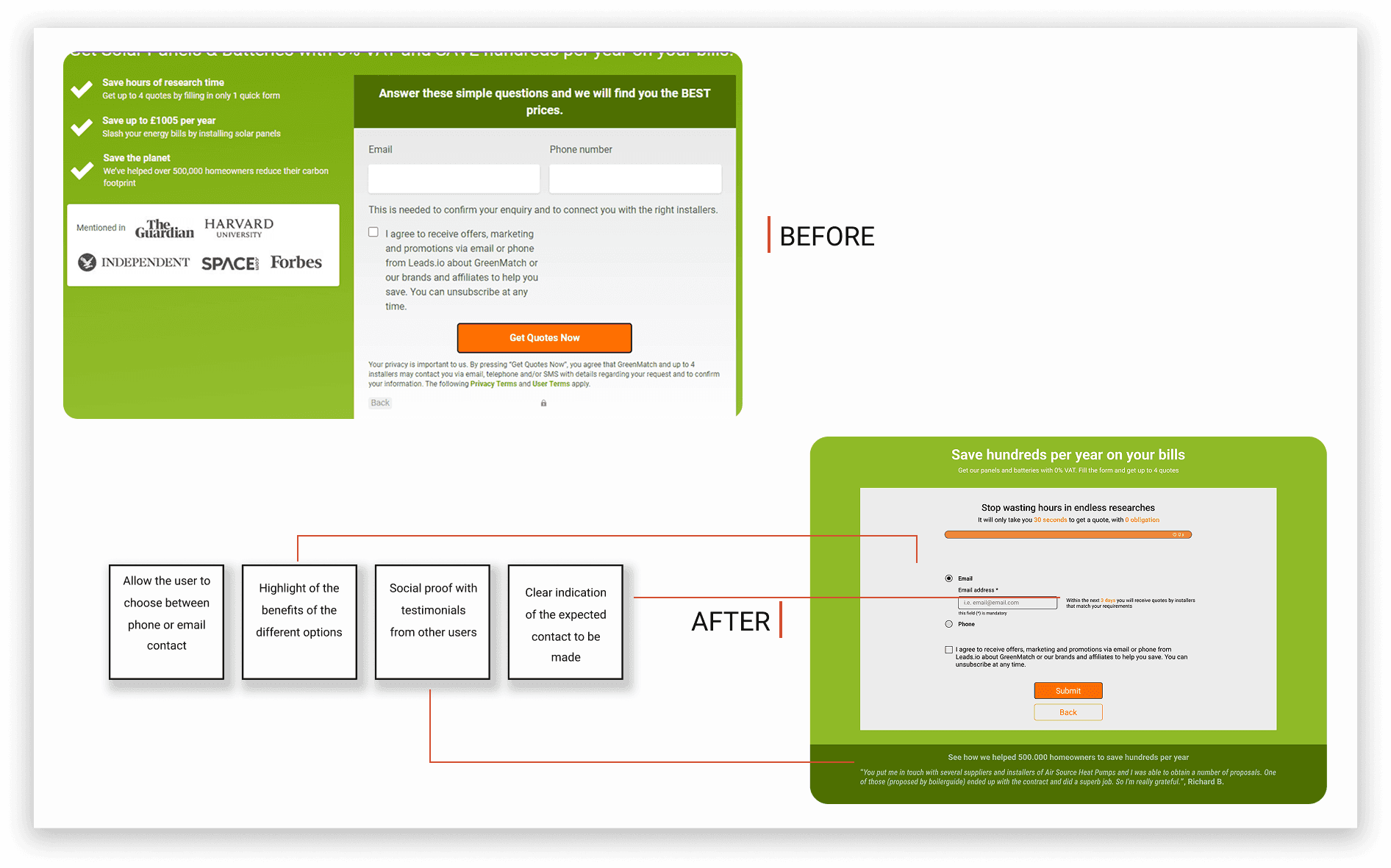
I redesigned the form architecture to improve scannability and reduce confusing behavior when multiple options were displayed.

In parallel, I introduced reassurance elements such as clearer benefit communication, stronger social proof, and explicit expectations.

LEARNINGS FROM THE PROJECT

Although this originated as a design challenge, I approached it as a real business and product problem rather than an isolated UI exercise.
My focus was on demonstrating not only the solution, but the decision-making process behind it.

What I’m most proud of in this project is how the redesign moved beyond surface usability fixes and addressed the deeper dynamics driving users’ abandonment.

Other projects I worked on

Venato

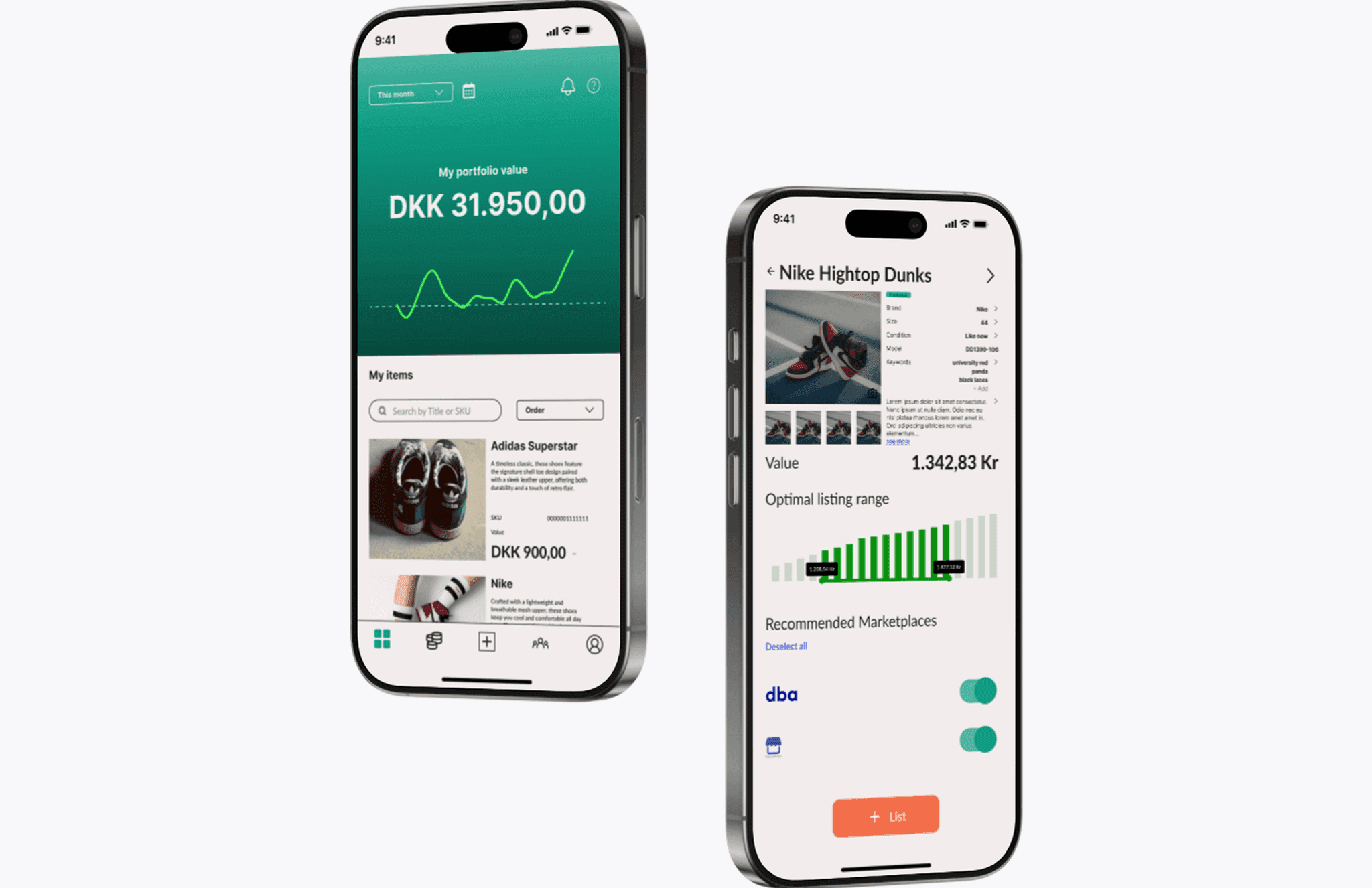
Venato: reducing seller listing friction by 85% through rapid product validation

Online resellers experience extremely high-friction in the reselling workflow. They spend between 40 and 120 minutes to create a single listing, which made the effort disproportionate to the financial return.

I transformed a high-friction reseller workflow into a rapid, AI-assisted listing experience that reduced creation time by 85% and improved seller decision confidence.
Read more about Venato
Social Bonding

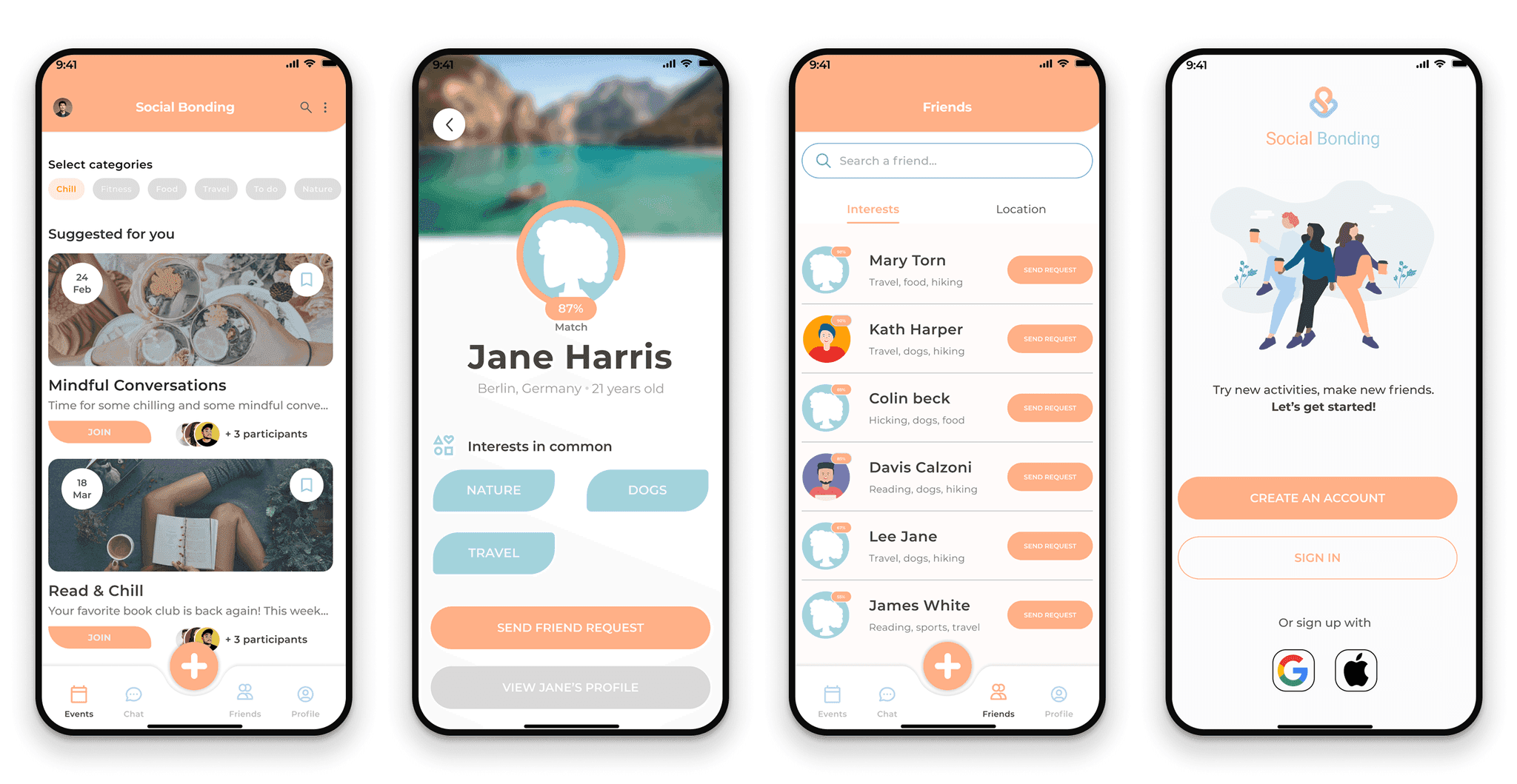
Social Bonding: a strategy to build a trust-centered social media app

Users have several trust issues when entering social media contexts, specially when it comes to prove the authenticity of the people they interact with, which directly impacts their will to engage and form meaningful connections.

Through early research, interviews, and competitive analysis, I identified key areas where users feel unsafe on other platforms, and designed a trust-centered user experience.

(project under NDA, some details about the product may have been changed)

Read more about Social Bonding

Let’s connect

Reach out on my social media accounts! I share insights about UX psychology and product features 🧠